See the development of the project in the gantt chart
Using the gantt chart, you get a clear overview of the progress of the project. The Gantt shows cases that have a start date and end date or have been assigned a version with a date. The horizontal bar chart runs along a time axis and the length of the posts varies and shows the working time planned for each subproject and the amount of work performed or remaining.
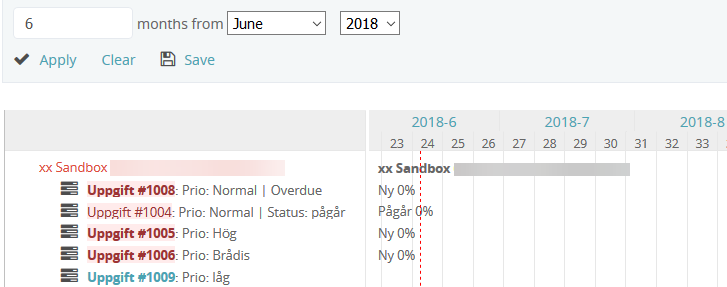
Green marking = active issues that have not yet passed the scheduled end date.
Red marking = the case has exceeded the scheduled end date.
The gray mark = remaining time for the case.
A gray bar = cases registered during the project without end date.
If the status of the case or “% Done” is used when the file is updated, that information is also updated in the gantt chart.
The Gantt chart is a module and the content is generated automatically, but it requires that you have enabled it on the project’s settings and specify the start and end date of the issues you create for the project.
Keep the cursor over a case in the schedule to quickly get more detailed information about it.
You can also click on the name of the case in the left margin to open it and read all the updates performed.
You can view the gantt chart in a browser on your account, but also print it out or save it as a PDF file. If you want to export the information in a file, create a .csv file. You can then open it in a program such as Excel.